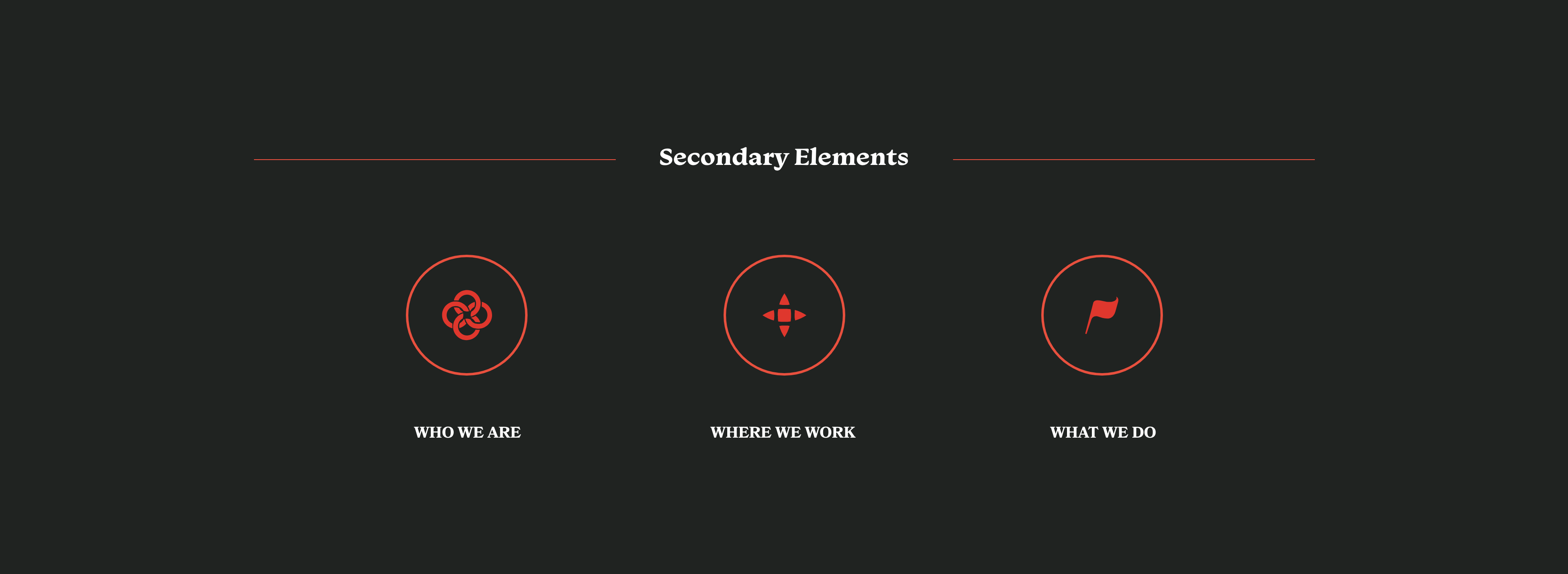
Solidarity Center is a Non-Profit Organization that promotes workers rights worldwide. The goal of this rebrand was to represent not only unity, but progression, strength, and equality. In the end, I wanted workers to know that they have a voice.
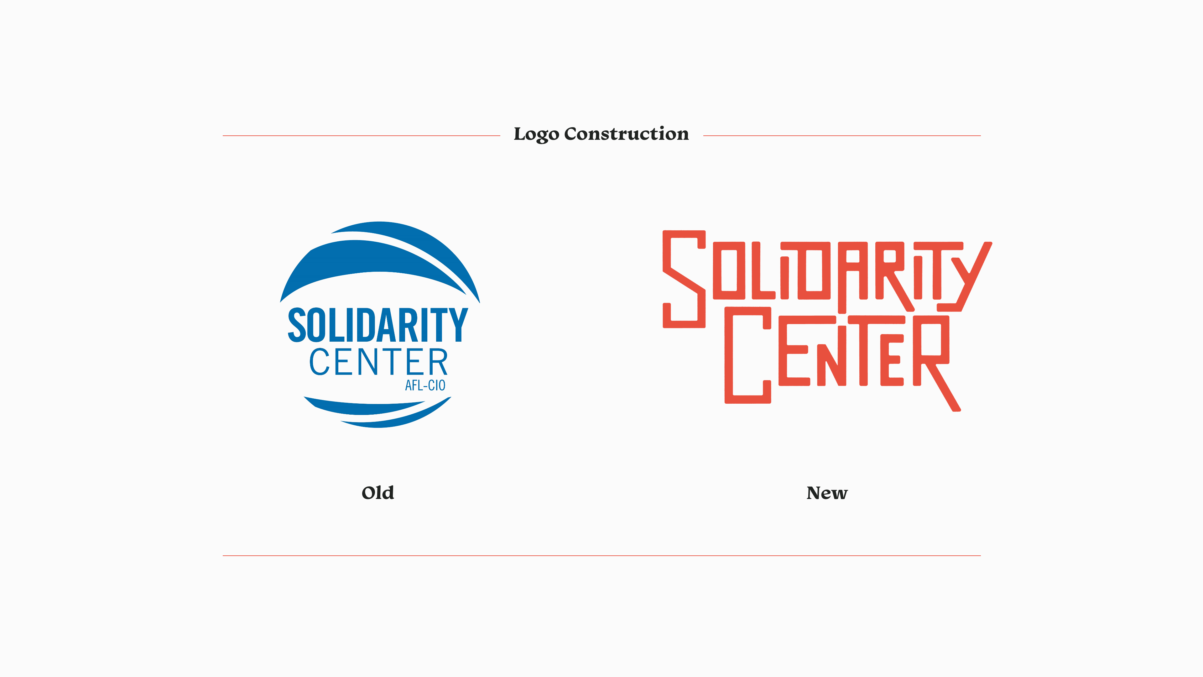
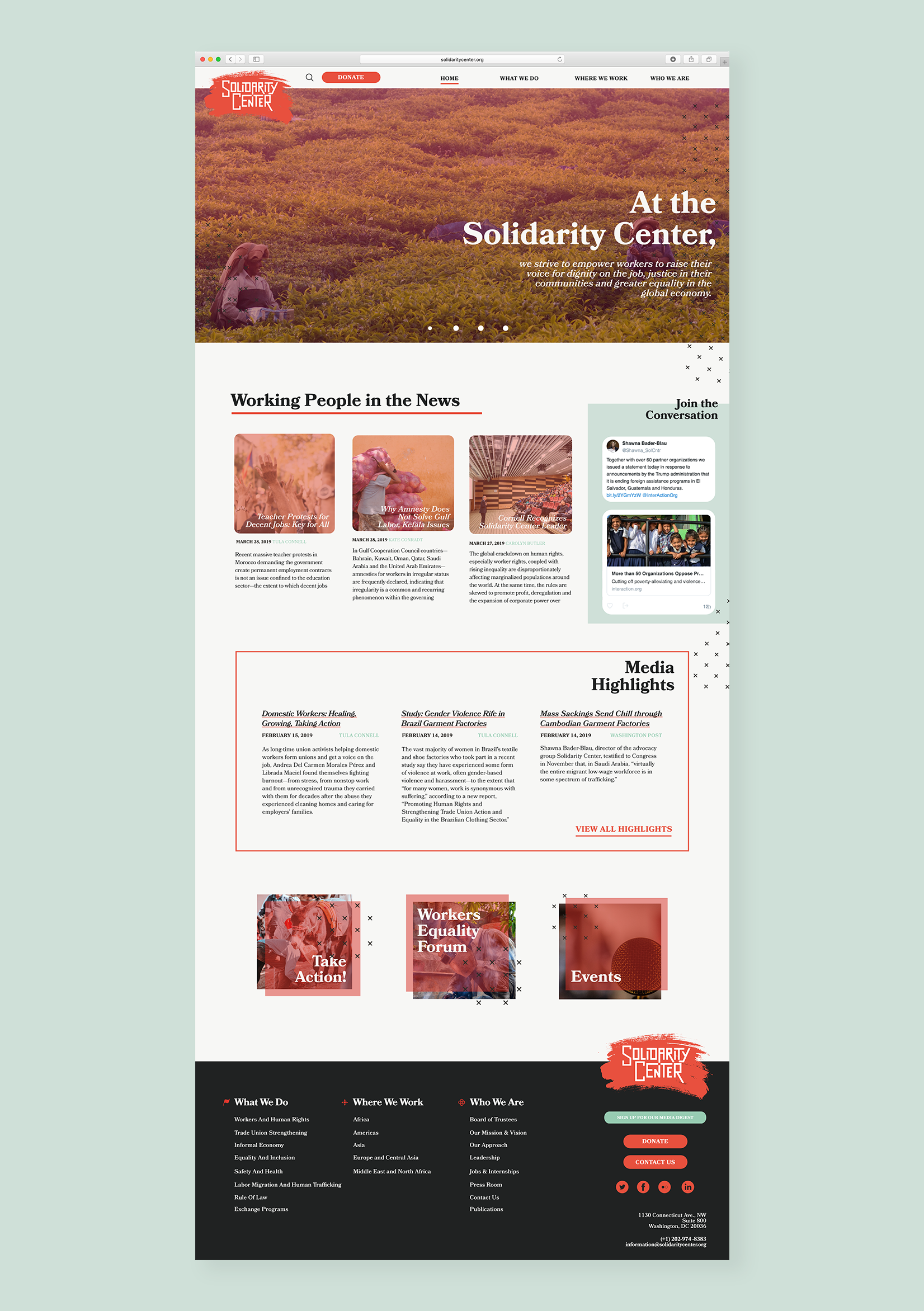
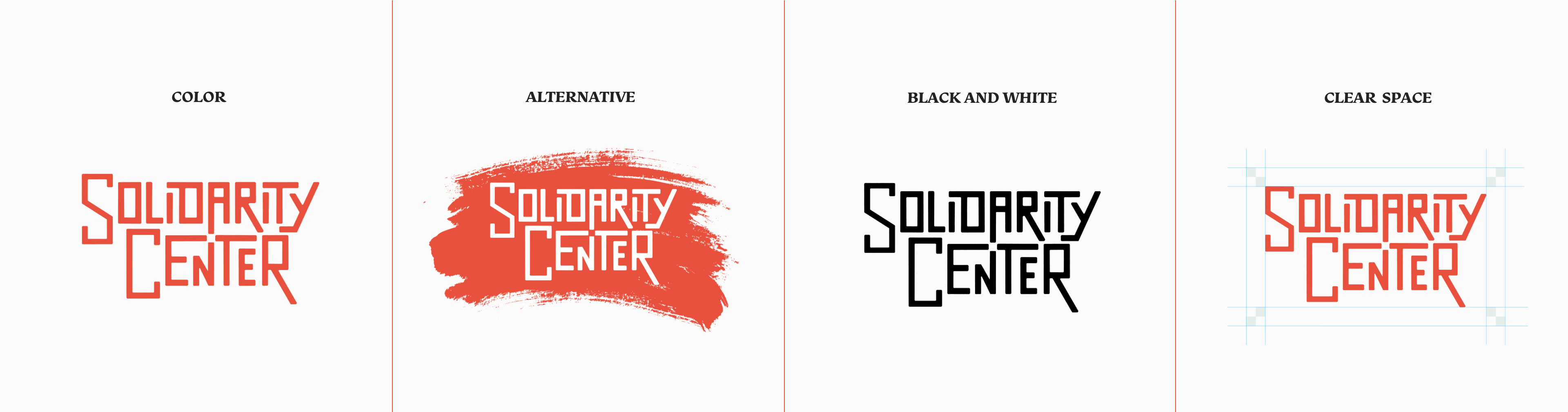
This logotype, unlike the old logo, represents the strength, progression, and unity that matches the vernacular of Solidarity Center. It commands a call to action, while not being too intimidating to the workers who need the Solidarity Center’s services. The red-orange color depicts determination and strength.
The logotype’s hidden symbology of unity is shown in the negative space between the two words with the ‘A’ in Solidarity and the ‘E, N, and T’ in Center. The forms come together to create a meeting point in the center of the logotype. The geometric and stylized characteristics of the logotype symbolize a hand-rendered quality that is reminiscent of protest posters, a heavy influencer.
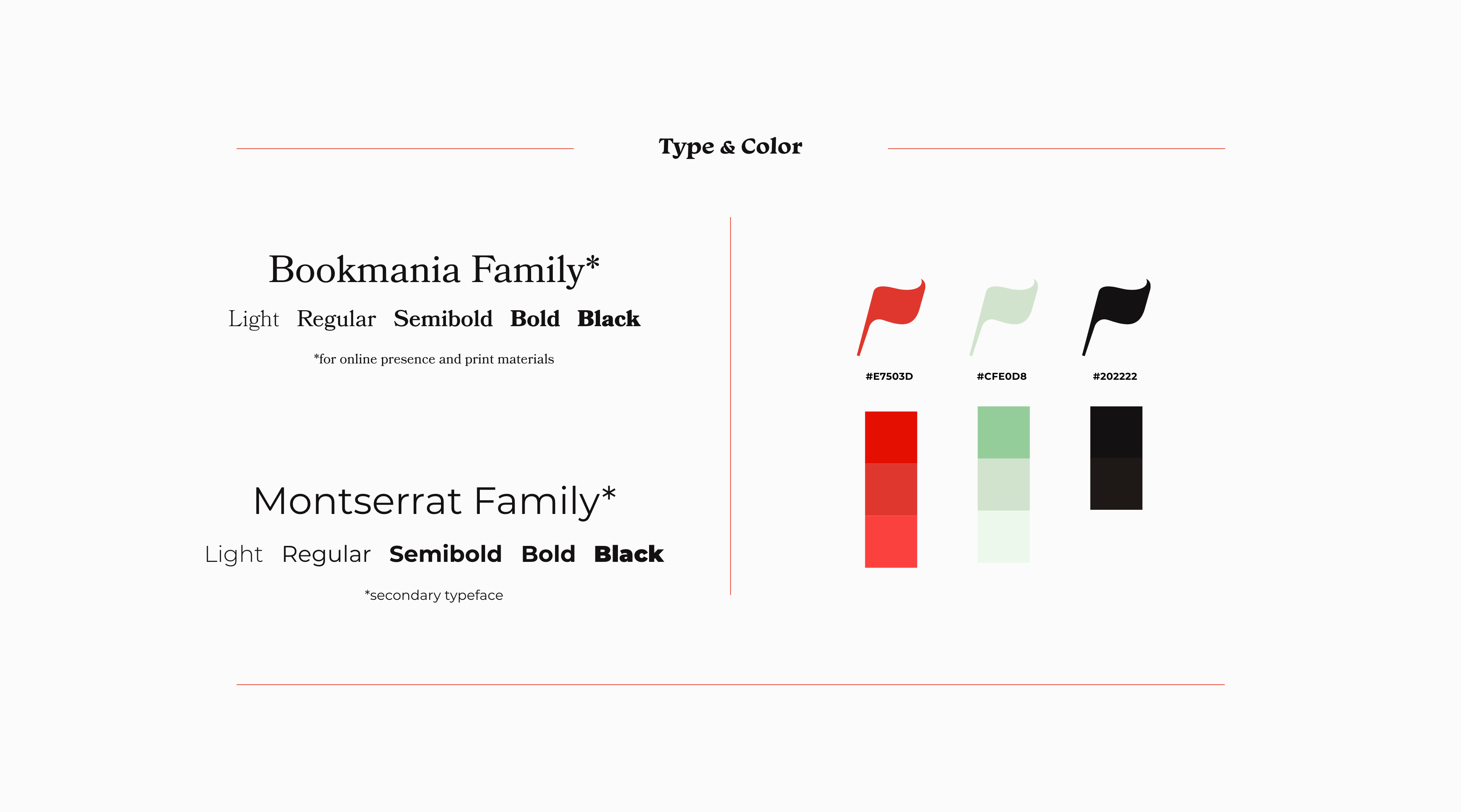
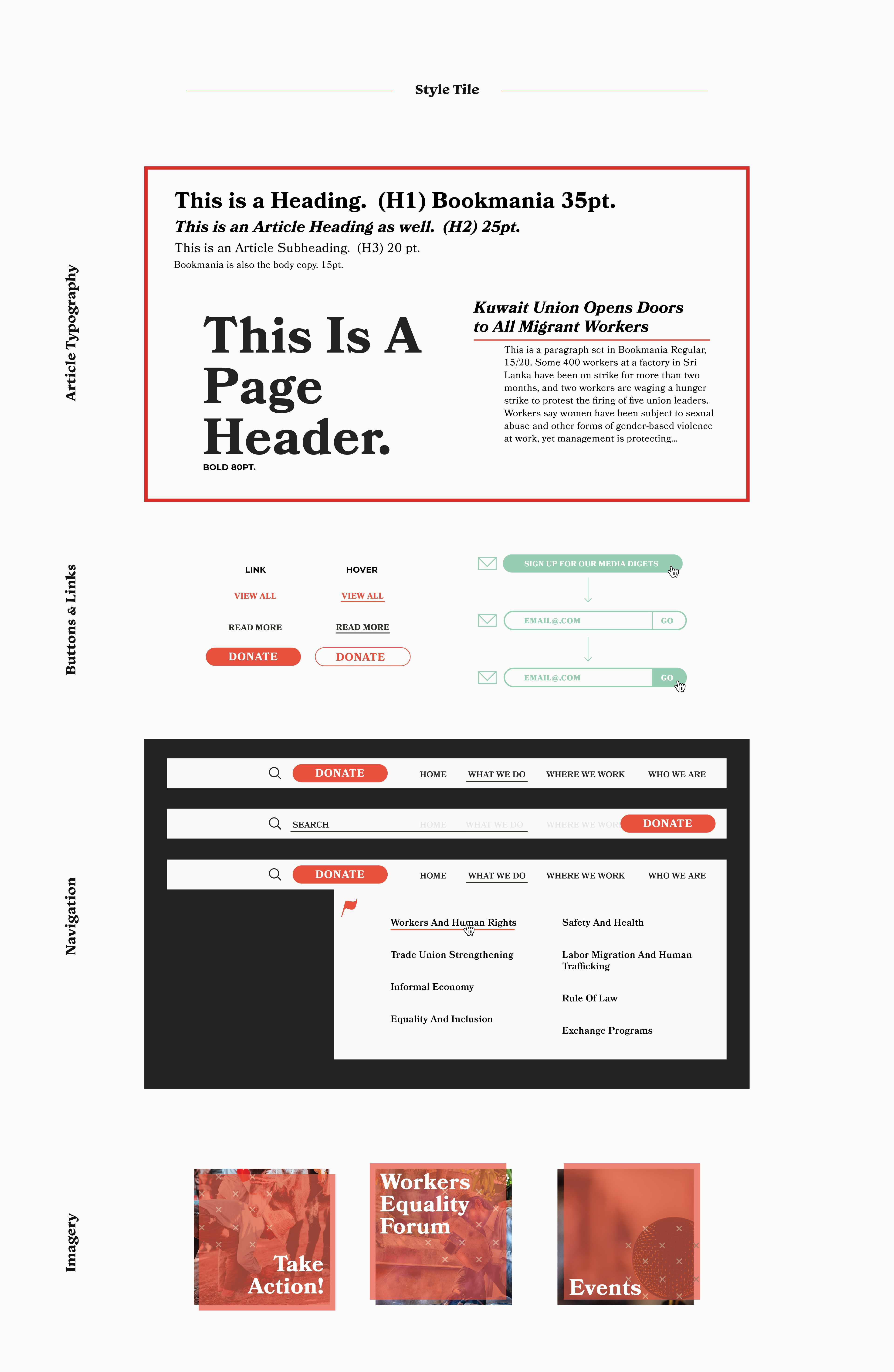
The typography chosen to represent Solidarity Center allows the company to switch between typefaces for the appropriate use. Bookmania, a serif works well with online articles, and print collateral, as Montserrat, an easy to read sans-serif, is useful for large format billboards and call to action materials.